우리가 살고있는 세상의 많은 현상들이 정규분포 모양을 따른다고 합니다.
한국인의 키와 몸무게도 정규분포를 따를까요?
정말 그런지 직접 확인해보았습니다다.
사이즈코리아(https://sizekorea.kr/)에서 인체치수데이터를 다운받았습니다. 사이즈코리아는 국민의 인체치수를 조사하고 보급하는 역할을 합니다. 16 ~ 69세 남녀 6,413명(남성 3,192명, 여성 3,221명)의 데이터입니다. 측정기간은 2015년 5월 ~ 2015년 12월 입니다.
전체 인원은 6413명입니다.
엑셀 데이터는 아래와 같습니다.
1) R Studio에서 데이터 불러오기
사이즈코리아에서 다운받은 파일은 엑셀형태입니다. R Studio 에서는 영어이름만 불러올 수 있기 때문에 파일 이름을 영어로 바꿔주었습니다. 아래와 같은 코드로 불러옵니다. 불러온 뒤에 data.frame으로 바꿔줍니다.
library(readxl)

md<- read_excel("파일경로")

md=as.data.frame(md)
str함수를 사용하면 열(column)목록을 볼 수 있습니다. 목록이 너무 많아서 뒷부분이 잘리는데요. 아래 코드를 추가하면 전체 목록을 볼 수 있습니다. (일부만 적었습니다.)
> str(md, list.len=ncol(md))

'data.frame': 6420 obs. of  148 variables:

 $ ⓞ_02_성별                         : chr  "남" "남" "남" "남" ...
 $ ⓞ_06_나이_반올림                  : num  25 28 19 20 22 23 24 24 27 26 ...
 $ ⓞ_12_골격근량                     : num  33.2 44.5 36.5 35.2 40.4 41.5 50 44.5 38.1 35.5 ...
 $ ⓞ_13_체지방량                     : num  13.6 28.7 5.6 7 11.6 21.1 13.4 9.4 8.4 11.1 ...
2) 키 히스토그램 그리기
키 데이터를 height에 저장합니다. 키는 mm로 입력되어있기 때문에 0.1을 입력합니다. $과 열이름을 입력하면 해당열을 가져올 수 있습니다.
height=(md$"①_003_키")*0.1
히스토그램을 그릴건데요. 먼저 최대,최소값을 찾아봅시다.
> min(height,na.rm=TRUE)
[1] 135.4

> max(height,na.rm=TRUE)
[1] 191.5
히스토그램은 아래 코드를 이용하여 그립니다. 전체 코드입니다.
library(readxl)md<- read_excel("파일경로")
md=as.data.frame(md)

#키 데이터만 변수로 저장
height=(md$"①_003_키")*0.1

#x범위
x_range=seq(130,200,by=2)

#히스토그램 만들어서 저장, plot=FALSE로 설정하여 그려지지 않게함
hist_height=hist(height, breaks=x_range, plot = FALSE)

#y축 최댓값
y_max=max(hist_height$counts)

#plot 함수로 히스토그램 그림. ann=FALSE로 설정하여 그래프이름과 축이름 나오지 않게함. #axes=FALSE로 설정하여 축의 tick이 나오지 않게함.
plot(hist_height, col="gray",ann=FALSE,axes=FALSE,ylim=c(0,y_max))

title(main="전체 키",xlab="height(cm)",ylab="Frequncy",cex.main=1.6)

#축 설정
x_axis_tick=x_range
axis(side=1,at=x_axis_tick)
y_axis_tick=seq(0,y_max,by=10)
axis(side=2,at=y_axis_tick)

#범례 설정
legend("topright","height",fill="gray")box("figure", col="gray")
그래프는 아래와 같습니다.

어떤가요 정규분포 모양인가요?? 제 눈에는 봉우리가 두개로 보입니다. 전체적으로 정규분포 느낌이긴한데, 정규분포 두개가 합쳐진 그림이에요. 남녀 따로도 그려봅시다.
#엑셀 데이터 불러오기library(readxl)md<- read_excel("파일경로")
md=as.data.frame(md)

#남녀 키 데이터를 변수로 저장
male_height=0.1*md[md$"ⓞ_02_성별"=="남","①_003_키"]
female_height=0.1*md[md$"ⓞ_02_성별"=="여","①_003_키"]

#히스토그램 그리기
x_range=seq(130,200,by=2)

#히스토그램 만들어서 저장, plot=FALSE로 설정하여 그려지지 않게함
male_height_hist=hist(male_height, breaks=x_range, plot = FALSE)
female_height_hist=hist(female_height, breaks=x_range, plot = FALSE)

#y축 최댓값
y_max=max(max(male_height_hist$counts),max(female_height_hist$counts))

#plot 함수를 이용하여 hist1과 hist2를 그림. #ann=FALSE로 설정하여 그래프이름과 축이름 나오지 않게함. #axes=FALSE로 설정하여 축의 tick이 나오지 않게함. 투명도를 설정함
plot(male_height_hist, col=adjustcolor("blue",alpha=0.5),ann=FALSE,axes=FALSE,ylim=c(0,y_max))
plot(female_height_hist,col=adjustcolor("red",alpha=0.5), add = TRUE)

#title함수를 이용하여 그래프이름과 축이름 설정

title(main="남자 키 and 여자키",xlab="height(cm)",ylab="Frequncy",cex.main=1.6)


#축 설정
x_axis_tick=x_range
axis(side=1,at=x_axis_tick)
y_axis_tick=seq(0,y_max,by=10)
axis(side=2,at=y_axis_tick)

#범례 설정
legend("topright",c("male","female"),fill=c("blue","red"))

#테두리 설정
box("figure", col="gray")
그래프를 그려봅시다.

각각 그렸더니 정규분포의 모양이 나옵니다. 남자와 여자의 키는 각각 다른 정규분포를 따르고 있다는 것을 알 수 있습니다. 남자키의 평균키가 더 크구요. 분산은 비슷해보입니다.
한번 구해봅시다.
> mean(male_height,na.rm=TRUE)
[1] 172.2437

> mean(female_height,na.rm=TRUE)
[1] 158.7105

> var(male_height,na.rm=TRUE)
[1] 35.37629

> var(female_height,na.rm=TRUE)
[1] 32.90762
평균은 남자가 훨씬 높고, 분산은 비슷합니다. t검정과 등분산검정을 해보면 더 정확히 알 수 있습니다.
먼저 F검정입니다.
> var.test(male_height,female_height)

 F test to compare two variances

data:  male_height and female_height

F = 1.075, num df = 3194, denom df = 3223, p-value = 0.04051
alternative hypothesis: true ratio of variances is not equal to 1

95 percent confidence interval:

 1.003132 1.152069

sample estimates:
ratio of variances

          1.075018
0.04면 유의차가 있다고는 할 수 있지만 크지는 않습니다.
t검정을 합시다. 만약 등분산이면 var.equal = TRUE 옵션을 추가해야 하지만, 이분산이므로 그냥 진행합니다.
> t.test(male_height,female_height)

 Welch Two Sample t-test

data:  male_height and female_height

t = 92.773, df = 6403.9, p-value < 2.2e-16

alternative hypothesis: true difference in means is not equal to 0

95 percent confidence interval:

 13.24721 13.81914

sample estimates:

mean of x mean of y

 172.2437  158.7105
유의차가 있습니다. 0값이 거의 0입니다. 당연한 결과입니다.
3) 몸무게 히스토그램 그리기
키와 같은 방법으로 그리겠습니다. 먼저 전체 몸무게 분포를 그려보겠습니다.
#엑셀 데이터 불러오기
library(readxl)
md<- read_excel("C:/Users/makhi/OneDrive/01.Statistics/@SIZE_KOREA/2015_7_data.xlsx")
md=as.data.frame(md)

#몸무게 데이터만 변수로 저장
weight=(md$"①_031_몸무게")

#x범위
x_range=seq(36,140,by=2)

#히스토그램 만들어서 저장, plot=FALSE로 설정하여 그려지지 않게함
hist_weight=hist(weight, breaks=x_range, plot = FALSE)

#y축 최댓값
y_max=max(hist_weight$counts)

#plot 함수로 히스토그램 그림. ann=FALSE로 설정하여 그래프이름과 축이름 나오지 않게함. #axes=FALSE로 설정하여 축의 tick이 나오지 않게함.
plot(hist_weight, col="gray",ann=FALSE,axes=FALSE,ylim=c(0,y_max))

#그래프이름, 축이름 설정
title(main="전체 몸무게",xlab="weight(kg)",ylab="Frequncy",cex.main=1.6)

#축 설정
x_axis_tick=x_range
axis(side=1,at=x_axis_tick)
y_axis_tick=seq(0,y_max,by=10)
axis(side=2,at=y_axis_tick)

#범례 설정
legend("topright","height",fill="gray")

box("figure", col="gray")
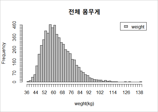
그래프를 그려봅시다. 결과가 재미있게 나왔습니다. 정규분포가 아니라 약간 왼쪽으로 치우친 형태입니다. 통계용어로 right skewed 라고 합니다. 제생각에 키는 우리가 통제할 수 없는 변수이기 때문에, 자연적인 결과인 정규분포가 나타난 것 같구요. 몸무게는 통제할 수 있습니다. 다이어트를 해야한다는 압박감? 체중감량에 대한 도전들이 그래프에 반영되어 있는 것 같아요.
이번에는 남녀 따로 그려봅시다.
#엑셀 데이터 불러오기
library(readxl)

md<- read_excel("파일경로")
md=as.data.frame(md)

#남녀 몸무게 데이터를 변수로 저장
male_weight=md[md$"ⓞ_02_성별"=="남","①_031_몸무게"]
female_weight=md[md$"ⓞ_02_성별"=="여","①_031_몸무게"]

#히스토그램 그리기
x_range=seq(36,140,by=2)

#히스토그램 만들어서 저장, plot=FALSE로 설정하여 그려지지 않게함
male_weight_hist=hist(male_weight, breaks=x_range, plot = FALSE)
female_weight_hist=hist(female_weight, breaks=x_range, plot = FALSE)

#y축 최댓값
y_max=max(max(male_weight_hist$counts),max(female_weight_hist$counts))

#plot 함수를 이용하여 hist1과 hist2를 그림. #ann=FALSE로 설정하여 그래프이름과 축이름 나오지 않게함. #axes=FALSE로 설정하여 축의 tick이 나오지 않게함. 투명도를 설정함
plot(male_weight_hist, col=adjustcolor("blue",alpha=0.5),ann=FALSE,axes=FALSE,ylim=c(0,y_max))
plot(female_weight_hist,col=adjustcolor("red",alpha=0.5), add = TRUE)

#title함수를 이용하여 그래프이름과 축이름 설정
title(main="남자 몸무게 and 여자몸무게",
      xlab="weight(kg)",
      ylab="Frequncy",cex.main=1.6)

#축 설정
x_axis_tick=x_range
axis(side=1,at=x_axis_tick)
y_axis_tick=seq(0,y_max,by=10)
axis(side=2,at=y_axis_tick)

#범례 설정
legend("topright",c("male","female"),fill=c("blue","Red"))

#테두리 설정
box("figure", col="gray")
그래프를 그려봅시다.
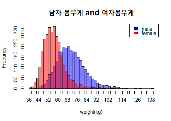
남자 보다 여자 몸무게가 더 낮은쪽에 분포하고 있습니다. 키와 다른 점은, 여자의 분산이 더 작다는 것입니다. 한번 구해봅시다.
> mean(male_weight,na.rm=TRUE)
[1] 70.95421

> mean(female_weight,na.rm=TRUE)
[1] 56.80975

> var(male_weight,na.rm=TRUE)
[1] 139.0882

> var(female_weight,na.rm=TRUE)
[1] 76.84672
평균은 남자가 높고, 분산도 남자가 두배가량 높습니다. 키의 분산은 비슷했는데, 몸무게는 여자의 분산이 훨씬 작습니다. 재밌는 결과네요. f검정과 t검정도 해봅시다.
분산의 유의차는 상당합니다. p값이 거의 0입니다.
> var.test(male_weight,female_weight)

 F test to compare two variances

data:  male_weight and female_weight

F = 1.8099, num df = 3190, denom df = 3221, p-value < 2.2e-16
alternative hypothesis: true ratio of variances is not equal to 1

95 percent confidence interval:

 1.688857 1.939732

sample estimates:

ratio of variances

          1.809943
평균도 유의차가 있습니다.
> t.test(male_weight,female_weight)

 Welch Two Sample t-test

data:  male_weight and female_weight

t = 54.467, df = 5889.7, p-value < 2.2e-16

alternative hypothesis: true difference in means is not equal to 0

95 percent confidence interval:

 13.63538 14.65355

sample estimates:

mean of x mean of y

70.95421 56.80975'@ 통계 교양 > 통계로 세상보기' 카테고리의 다른 글
| 병 진단과 조건부확률 (양성이 나왔을 때 병에 걸려있을 확률) (0) | 2021.08.25 |
|---|---|
| 물가상승률은 어떻게 계산되는걸까? (물가상승률과 물가지수) (0) | 2021.03.01 |
| 나라별 국가채무 확인하는 방법(IMF 홈페이지) (0) | 2021.02.28 |
| 대학 학과 별 입학자 수 확인하는 방법 (0) | 2020.07.04 |
| 세계 500대 부자 자산에도 파레토법칙이 적용될까?? (0) | 2020.05.14 |
| 우리나라는 어느 연령의 인구 수가 가장 많을까? (2) | 2020.05.12 |
| 세계 인구가 '현재' 몇명인시 실시간으로 알려주는 사이트 (0) | 2020.05.11 |
| 유소년층 인구는 얼마나 줄어들고 있을까 (주민등록 인구통계) (0) | 2020.01.23 |


댓글
bigpicture님의
글이 좋았다면 응원을 보내주세요!
이 글이 도움이 됐다면, 응원 댓글을 써보세요. 블로거에게 지급되는 응원금은 새로운 창작의 큰 힘이 됩니다.
응원 댓글은 만 14세 이상 카카오계정 이용자라면 누구나 편하게 작성, 결제할 수 있습니다.
글 본문, 댓글 목록 등을 통해 응원한 팬과 응원 댓글, 응원금을 강조해 보여줍니다.
응원금은 앱에서는 인앱결제, 웹에서는 카카오페이 및 신용카드로 결제할 수 있습니다.